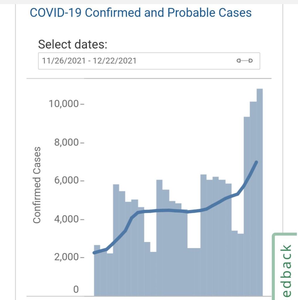
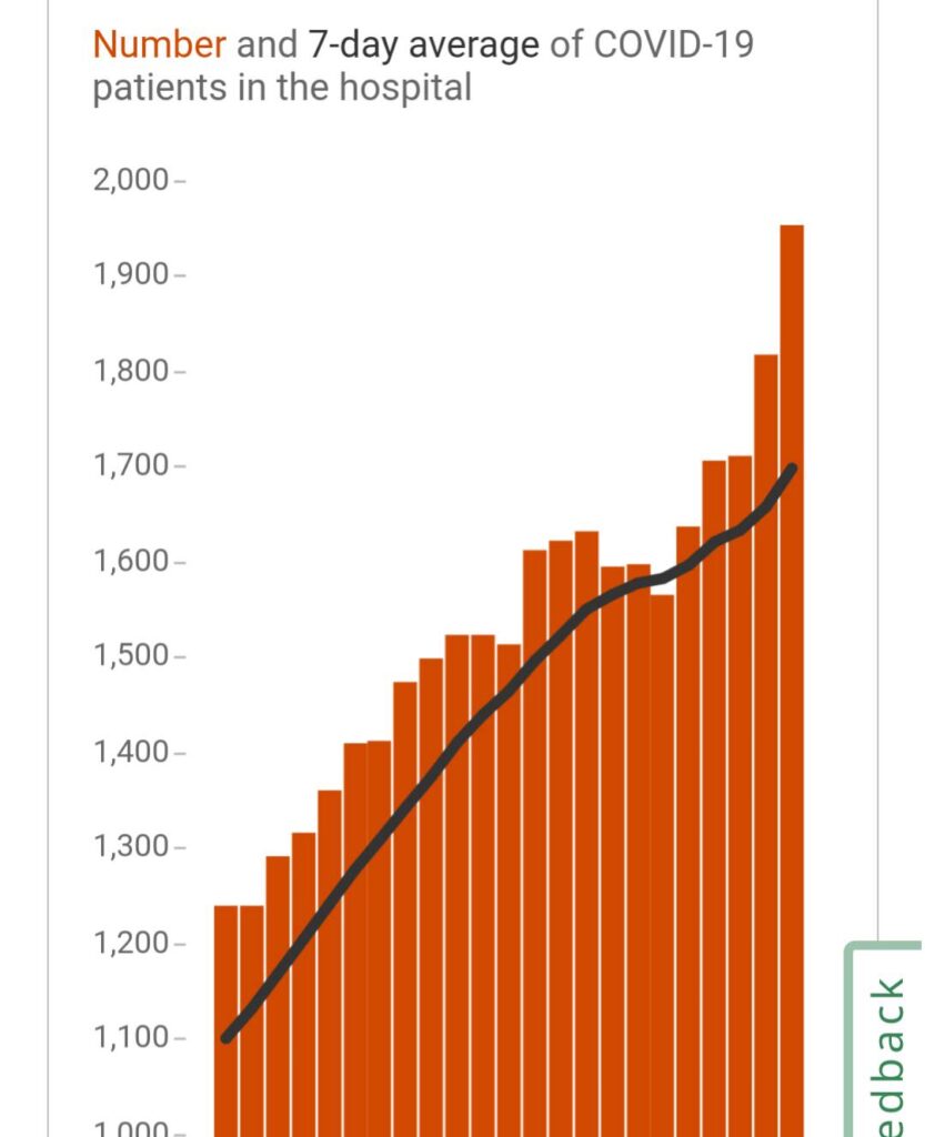
Omicron: here’s the data I’m looking at.
I’m posting this just so everyone can see how I’m looking at cases and hospitalizations and trying to figure out how bad Omicron is.
When checking hospitalizations, the important thing is not how COVID is spreading *today*, but how it was spreading about 10 days ago.10 is a magic number with COVID. *Most* people will have recovered after 10 days. The (fairly large, with Delta) minority who end up in the hospital really start entering after 10 days. It’s like a fork in the road.
So, the really interesting thing for Omicron is figuring out what percentage of people take that fork. Doing that requires looking at how many are taking the fork, and how many got on the road a while back. How many are getting on the road today isn’t interesting, because they’re *not* at the fork, yet.
Additionally, data is presented very differently. What everyone loves to report is number of new cases. That’s great, but that’s like asking someone “where are you” and getting the answer “I’m going 50 mph”.
For hospitalizations, everyone loves the number of people *in* the hospital. That’s like asking “how many people are going to McDonald’s?* and getting the answer “well there are 20 people there now”. Of course, since McDonald’s has a maximum seating capacity, we *do* care about the number we’re given. When that max is reached, if new people keep arriving they’re going to be standing around hungry. “Hungry” is really bad in this metaphor.
These things are related by calculus. The relationships are reasonably simple, but most people don’t want to deal with the calculus. As it happens, these things are actually the right things to compare
.Most people also don’t want to deal with that 10 day delay. That delay is “particularly* important when we’re observing a new variant and asking “how bad is this one?” Most sites do NOT give this information in a way that’s easy to compare.
So, here are some graphs of these numbers (for Massachusetts). You’ll see that they’re for 2 different date ranges. This is the correct comparison. I’ve also picked the time after Omicron was detected in Massachusetts, so theoretically our numbers should be seeing the spread.
What we’re looking for is the *shape* of the graphs. Because people heal from COVID, if the new case rate is constant, the number in the hospital is *also* constant (roughly). So, if we see new cases increase on a straight line, and 10 days later we do NOT see hospitalizations increase, we say “this variant doesn’t put people in the hospital”. Of course, people don’t always do things things at the same rate, so the lines aren’t nice and smooth. We do things to the data to try to smooth it out but that means we’re increasing the delay even more. Mostly this data is presented as a rolling average. Rolling averages are great at reducing the impact of a single bad day but they obscure an actual change in the rates for a while.
So, after all this, here are the graphs of new cases and hospitalizations. What I’m looking for is hospitalizations to NOT increase like new cases. I would like this — it would mean Omicron is not so bad.And this leads us to the problem: the data isn’t clear, yet. Is that rise in the last few days just random “shit happens”? Or, is it hospitalizations following the new case rate?If we behave like the UK has, it’s the former.
Here’s how I’m looking at this: both graphs have a spike on the right side. That’s troubling. The new case rate was somewhat flat while hospitalizations we’re increasing. What? Well, I’ve read something about Omicron actually infecting (and presumably hospitalizing) people faster than Delta, so maybe that 10 days is actually 8 days now…hmm.
I can’t really tell what *is* happening, but that’s pretty common. So I look for what I think might be happening and try to support it:IF Omicron has MUCH lower hospitalization rates than Delta and IF it has the same progression times, and IF the time period I’ve captured shows the spread of Omicron, THEN I should not be seeing hospitalization rates spike up significantly.<Looks at data> Nope, I can’t say that. I see a spike. That means I *cannot* support my theory that Omicron is better than Delta.
So, what might be wrong?
Well, I’ll have to look at when Delta was spiking, and see the hospitalization rates there (this would be the theory that Omicron is a bit better, but not amazingly better). Maybe Omicron has different progression, so 10 days isn’t the right delay. (But those spikes seem to line up well.)And, last…maybe I just need more data to get a more clear picture. That’s kinda where I am right now.
What does more data look like? It means longer periods of time with Omicron spreading so the averaging works better
.It also could mean looking at a different result, like death rate. Death rate lags new cases by about 18 days, so we aren’t even close to having that data, yet.
Check back in around Jan 12th to see how many people we’ve killed, and we’ll be able to see if all those optimistic holiday gatherings were actually a good idea.